Selecting some key advice for such a broad process as prototyping is often tedious and even dangerous. UI/UX prototypes serve a number of goals, and these will change based on the project, your needs, concepts, platforms, industry, and a plethora of other markers.
However, we took inspiration from general market trends, our extensive knowledge, and practical experience in product design for various niches and clients. And came up with a list that covers universal concepts. Simple, yet very often overlooked.
UX first, UI later
It may be tempting to start drawing buttons and layouts, but there will be enough time for that later. The first step is to get the user experience right. It is the backbone of the whole product. Think about the customer journey, expected activity, empathy map, and everything else that may help you simplify the UX.
When there’s a solid structure in place, it will be much easier to wrap everything in a neat, functional, and pleasing interface. But that’s our next point.
Simple interfaces win every time
Steve Krug named his UX book “Don’t make me think.” And that’s exactly what the users respond best to. The harsh reality is that people are more likely to enjoy something familiar. Something that doesn’t take much effort to figure out.
Sacrificing some of the UI ideas in favor of simplicity and maybe even inspiration from existing products is necessary. Because this is the fastest way to help your clients see the value you’re offering. And frankly, overloading the user with a difficult interface is bad for business. Unless put in a life-or-death situation, confusing UI will most likely make the user rethink the idea of using the software. Especially if there’s a competitor who does things more understandably.
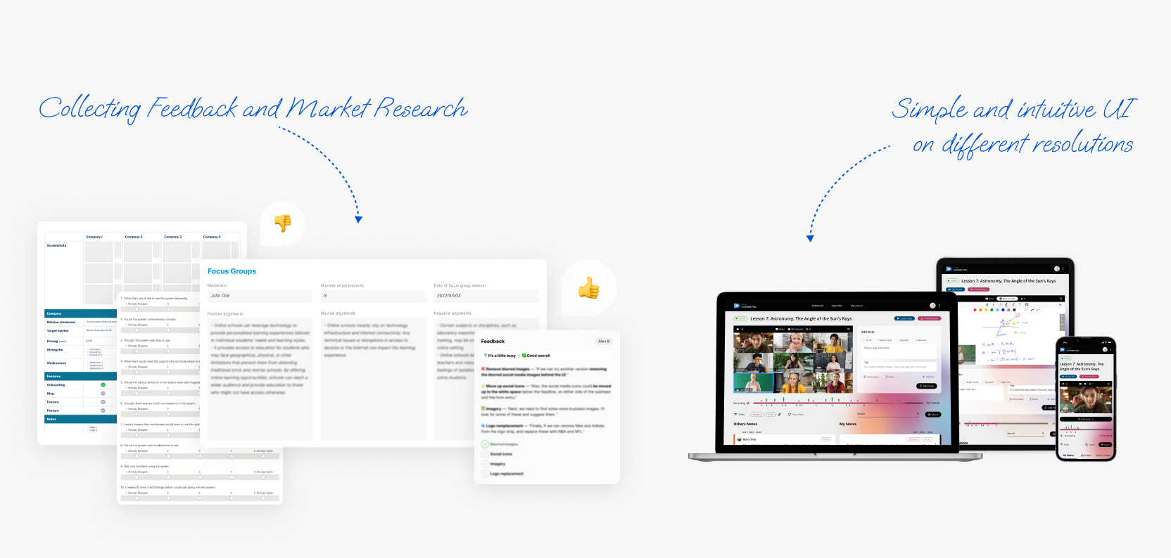
Cover as many resolutions as you can
If you’re building something web-based, make sure you invest enough time in a mobile version. If your product is developed for mobile from the get-go, pay attention to the resolutions your target audience will most likely use.
Even the slightest difference in display resolution may affect the user experience. Let alone the difference between desktop and mobile screens. And to do everything right, you might want to focus on this aspect during the prototype stage when mistakes cost less, and changes are fast.
Know your market
Research is a crucial step that precedes the creation of any good software prototype. First, take a look at your industry. Highlight the trends, and familiarize yourself with the problems if you haven’t already. See what the users generally ask for when using a certain service. Even if the idea seems amazing in your head, it must align with the market needs. Otherwise, you’ll just be wasting time and money.
Another step is to scan your competitors thoroughly. What are they doing wrong? Can you improve it? Analyzing your market rivals is a good way to avoid many risks and come up with new solutions. After all, why build something that won’t offer something better than existing solutions?

Take time to collect feedback
Especially important when creating a software prototype, this step highlights potential oversights and gives you valuable insights about required improvements. There is a couple of feedback sources:
- Stakeholders
- Friends, family
- Focus groups
Each of those groups can provide valuable feedback and point you in the right direction. Collecting opinions often resembles art. It takes the skill of the craftsman and tools of the highest quality. Paying attention to what people say is the first step towards building something people will love.
Prioritize the essentials
Define the necessary objectives that you want to meet during prototyping. Stick to them and don’t get distracted by less important aspects. If time and budget allow it, you can focus on that later. Getting too attached to certain ideas can wreck your progress and divert your attention from important things.
This is one of the most common prototyping mistakes, and prioritizing the essential aspects is key for a fine software prototype.
The takeaway
Creating a thought-out prototype takes patience and focus. But in return, you’ll get a visualization of your product that takes into account the most important things. Additionally, you will gain insights into the risks and ways to avoid them before starting development.
If we had to condense those tips even more, it would be:
- Make sure you match the needs of the market and users.
- Build the structure first, add the paint later.
- Always get a second opinion.
If you want more info on the matter, here are some of our software prototyping case studies , and the 5 things you should know when creating a clickable prototype.